Something from Nothing – Content Creation
This week we were given the task of creating a poster, video or any offering for a product. I enjoyed the assignment.
It is interesting to create an item and receive feedback on the result. Some people can see the author’s intention, while others get lost in the details.
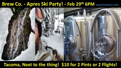
The image above offers a simple proposal; come have a beer after skiing. I used those specific images because they were my most recent pictures concerning the topic at hand.
The results were mixed. User comments to follow.
Is this a company event? I’m sorry but I am just a bit confused.. Don’t laugh, I’m old and don’t ski so maybe that’s where I’m confused. What is the “thing” and there is skiing in Tacoma? Wait is this “your” company? I really like the look of it and I always enjoy your work, so I hope I’m not sounding rude, that is not my intentions at all. I just wanted to know if this was a real place or not! Hahha
The message was not clear for this person. Part of the issue is that the image is intended to be displayed at a brewery. So the where would be clear. The what is lost in translation.
If you don’t ski, how can you apres ski? When would you?
Next Comment.
I enjoyed how simple of a flyer advertising a one day event, one detail I would have liked to see is an address, and an end time to the party. Otherwise great work, I believe you could make room for the extra information by shrinking the pictures slightly.
This person wants more clarity, where is this event happening? Simple fix. As far as the suggestion to shrink the pictures, maybe I did not include the address because I wanted to get people to look up the website. Conversion potential?
A simple QR code would offer the best of both.
Next comment. The poster was designed with this person in mind.
Your flyer is fun with clear photos. However, the 2nd one would be more effective if you used the whole face or cropped it out entirely. The waterfall is a good metaphor for drinking. Good job use of color and font. The location could be more descriptive than the “thing” –but I know what you are doing here.
Here the comments go back a forth, but the tone is positive.
The comments show the user clearly gets the intended message, but when added to the other comments it shows I created a targeted message based on assumptions of reader knowledge. This reader has seen a lot of my work and knows what I am talking about before seeing the image.
Essentially my targeted message was too narrowly focused. When designing a mass appeal message, make it clear.
The five w’s clearly presented will allow anyone to absorb the message.
